18CSE301J INFORMATION VISUALIZATION
ROHIT N(RA2011029010007)
Assignment 1
Overleaf link of the report is attached here Click Here
Assignment 2
TABLEAU PROJECT
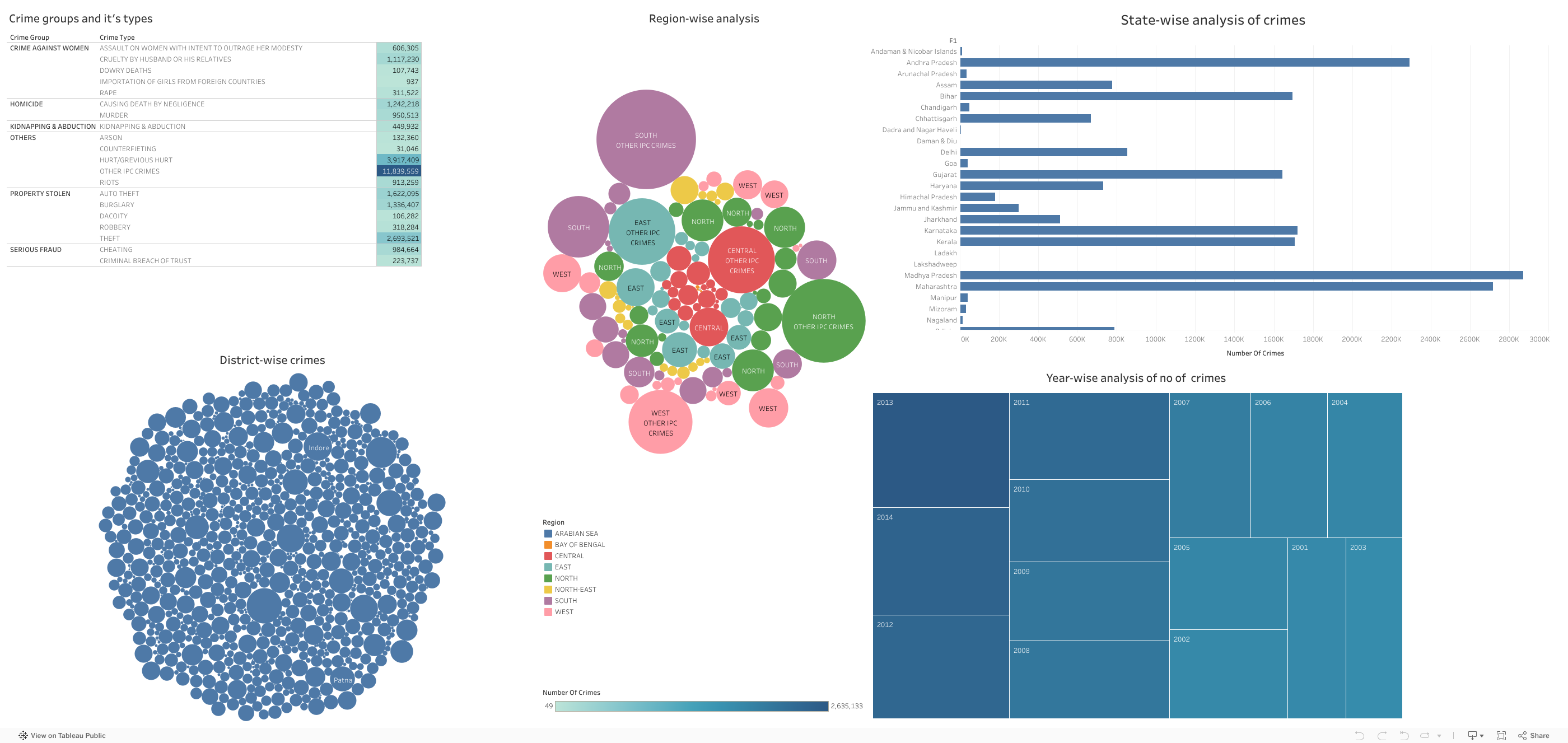
The Below Data is visualised and it provides the information of Crime in India.
Overleaf link of the report is attached here Click Here
The Below Data is visualised and it provides the information of Crime in India.

Above is the Highlight Table where i have grouped all the crime groups and the
types of crime done in that group also i stated the total number of crimes done
in the span of 14Yrs(2001-2014)

In the above diagram i have represented the state wise analysis of crime done in india
where i have taken x axis as the states and in the y axis i have taken the total number of crimes.
.jpg)

Here in the above two diagrams one represents the District wise crime analysis and the other one represents
the region wise analysis of crimes those circles represent the Dstrict and the Region The size of the circle
represents the number of crimes done by the respective place.

In this Tree map i have taken the Years and the total crimes done in the each year.
The rectangle which is large contains the larger number of crimes done.
I have taken the datset of Crime in India in which you get the number of crimes done in every state from year (2001-2014)
1.Pandas
2.NumPy
3.Matplotlib
4.Seaborn
5.Plotly
These libraries provides a powerful set of tools for data visualization in Python which allows us to create a wide range of charts
and visualizations to explore and communicate their insights.
1.Plotly for interactive data visualization
The Code for the below output is uploaded in observablehq
It is a Racing Bar Chart in which the bars represent the total number of covid cases of each continent
1.Explaination of Racing Bar Chart
4.Dataset for the about Output
The Dataset used is about Game of thrones which is weighted network of characters in the TV Show named Game of Thrones.
It has 353 edges and 108 nodes which represents the 108 characters linked by 353 links.

2.Dataset of the Visualised Data